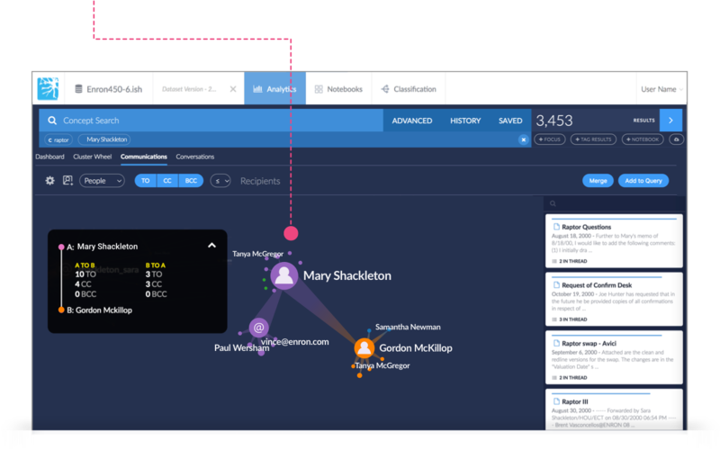
Communications is a feature that visually graphs email activities within a dataset. This allows users to view and analyze thousands of messages quickly, which is helpful when tracking the flow of information throughout an organization. With a few simple clicks, users are able to arrange clusters of messages, track what emails have been sent to who, and determine what email domains have been most accessed.
Communications Dashboard
The following topics describe the elements found in the Communications Dashboard and how to use them while exploring your results.
Filters and Layout
Customize your view of the communication chart by selecting the settings icon in the top left of the menu bar to view Filters and Layout.
The Filters and Layout dialog box will appear, similar to the example below. Use the sliders to customize your display.
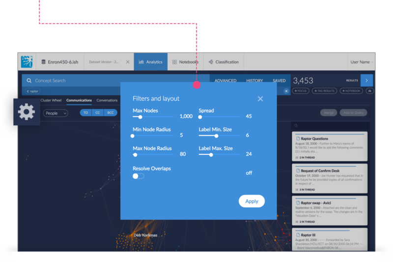
Max Nodes - Adjust the maximum number of Nodes that appear on the communication chart.
Min/Max Node Radius - Adjust how large or small a node will display.
Spread - Adjust the distance between the nodes. This is useful for clearing overlaps without having to activate Resolve Overlaps.
Label Min/Max Size - Adjusts how large or small a persons name or domain appears.
Resolve Overlaps Toggle - If active, the system will attempt to resolve overlapping nodes. In some cases, rendering will increase significantly.
People and Domains
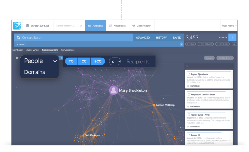
Click the pull down menu located in the top left of the menu bar to select “Domains” if you want to strictly view communication sent through a particular domain.
TO/CC/BCC
Toggle to filter whether a specific email address was included in the “TO, CC or BCC” field or if the communication was sent to or from a particular person/domain.
Recipient Volume
Click inside Recipient text field to set a value to modify the volume of communication that you want displayed. For instance, if you set the value as “< 100,” the communications chart will display emails that were sent to less than or equal to 100 people.
Nodes
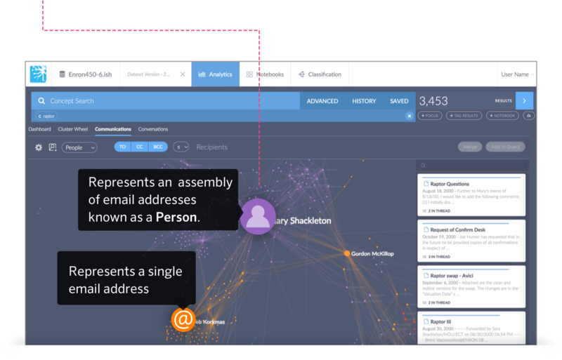
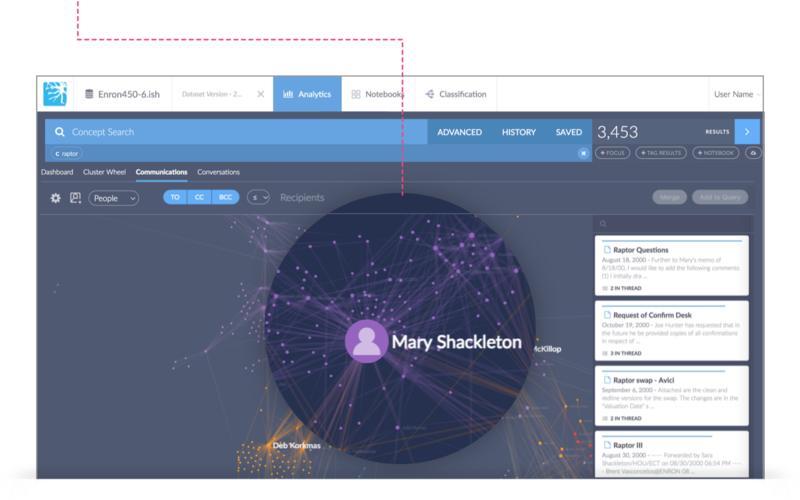
Within the Communications Dashboard, people and email addresses are displayed as nodes. A collection of different alias email addresses is known as a Person. The following example shows the icons used to represent a Person(purple node) and a single email address(orange node).
Node Groupings
Communications uses similar colors to people or groups of people that are in frequent communication with each other. The color of nodes can also depend on the type of label that has been assigned to that person or email address.
For an example, if a label has been created for “Account Executives” and that label color is purple, any person/email address that has been assigned that label will share have the same node color. *See People Manager for information on how to create and manage labels.
Note
If a person or email address doesn’t have any labels, then they're temporarily assigned a color by the probability that they belong in a certain group.
Node Details
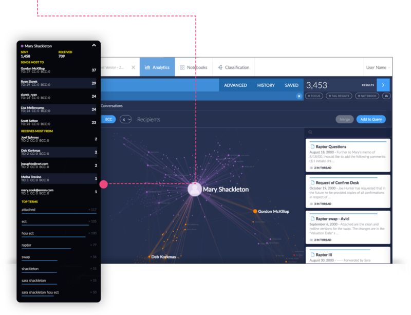
Click on one or more nodes to view details regarding email activity such as the number of Sent/Received messages, the top senders/recipients, and terms related to your selection.
Merging Multiple Nodes
The disambiguation of several email addresses associated with a single person relies on merging multiple nodes into a single multiple. This function helps with organizational purposes when working with thousands of emails.
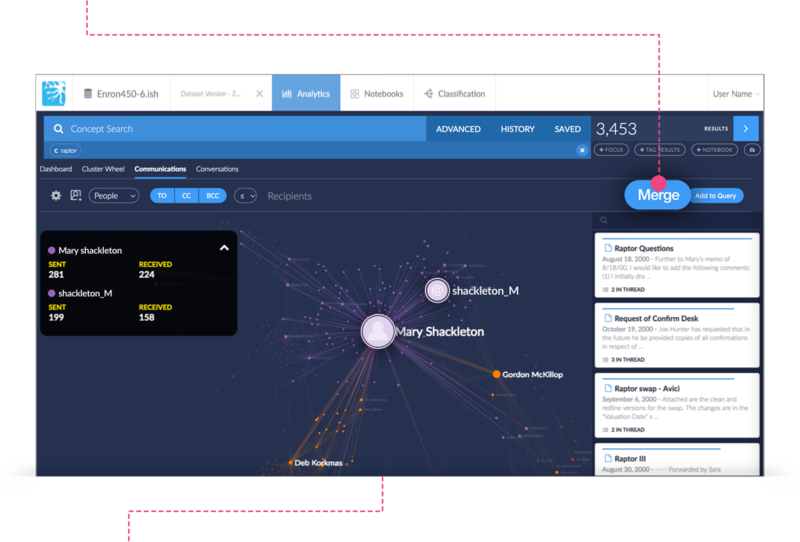
First, use either the keyboard’s SHIFT key, while clicking on multiple nodes.
Next, click the Merge button highlighted below in the upper right hand corner of the dashboard.
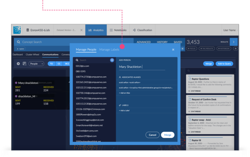
The Manage People screen will appear.
Click in the Add Person text field to enter a new or existing name. You can also add associated aliases and labels in this view as well. *See the People Manager section for more information on adding aliases and labels.
Click the Merge button and the selected nodes will be merged into one.
Edges
Nodes are connected to one another by lines that are called edges. Edges that have greater volumes of communication are emphasized. Edges that have a smaller volume of communication or that might be out of view are reduced in opacity.
Selecting an Edge
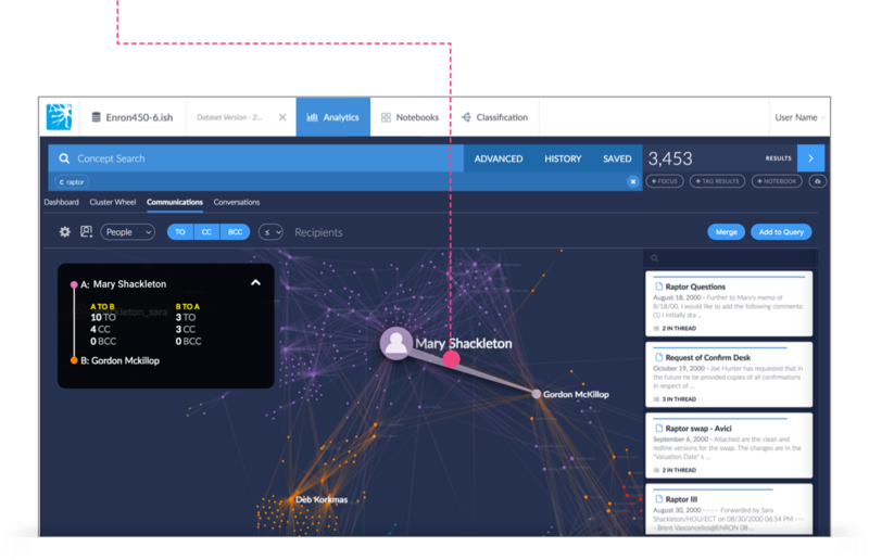
First, hover over an edge to highlight the connection between two nodes.
Next, click on the edge.
A card will appear in the upper left side of the dashboard that shows the details of the emails being exchanged between the nodes you have selected.
Adding Selections to A Query
Adding selections to a query allows you to further narrow down communication between one or more people. By adding people to your query the graph will reshape and the results column will display only the activity of the nodes that were selected.
First, select a node or nodes to add to your query. Remember, use either the keyboard’s CTRL, Command, or SHIFT key, while clicking on multiple nodes.
Next, click the Add to Query button located on the screen’s upper menu bar.
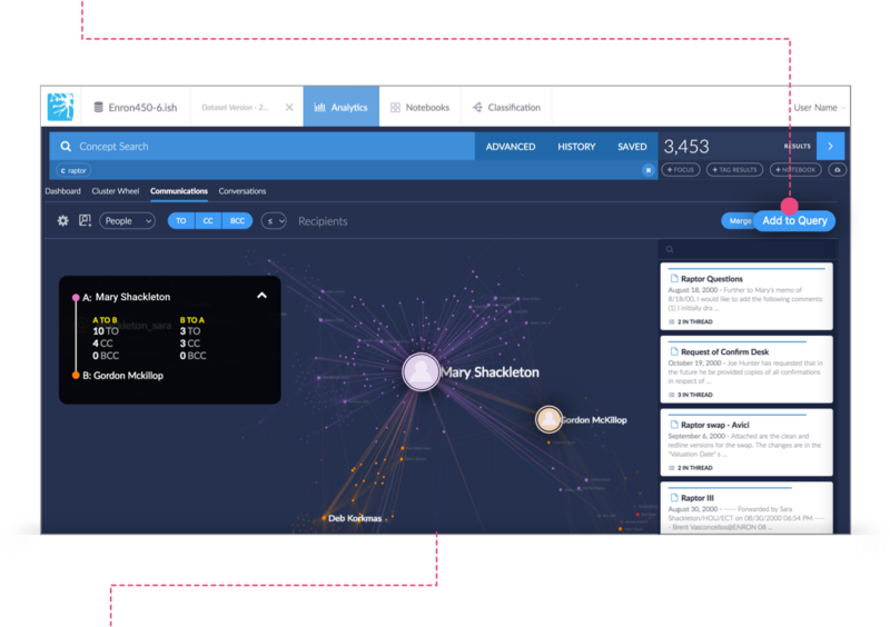
The graph will then reshape and display only the activity of the nodes that were selected. Additionally, the results column will update showing only the communication associated with the nodes you selected.
