The Settings menu option, which is available within the User menu in the upper right-hand corner of the interface, allows users to customize their individual review experience for a project.
![]()
There are three sections in the Settings screen: DOCUMENTS, DISPLAY and NOTIFICATIONS. The Settings screen contains a Search Settings box to quickly find an item within any of them. Click Save after making any change to set it.
Documents
Coding - Settings affecting the Document Review screen:
Force Explicit Save will require the reviewer to click the save icon at the extreme left of the Document Review toolbar to save any coding. The default unselected option will save all tag, folder, field, redaction or annotation coding by going to the Next or Previous document.
Enforce Required Fields for Related Documents relates to a Tag Profile setting called Selection Required that enforces populating values for Tags or Fields before the reviewer can move on to another document; these are called Required Fields. This setting asks if the user would like this to be enforced across all documents that share a related value, for example, Family members.
Auto Select Default Document Tags propagates tag choices set as default to related document types defined in the tag when tagging a parent document.
Navigation - Settings affecting the flow and enhancement of review navigation.
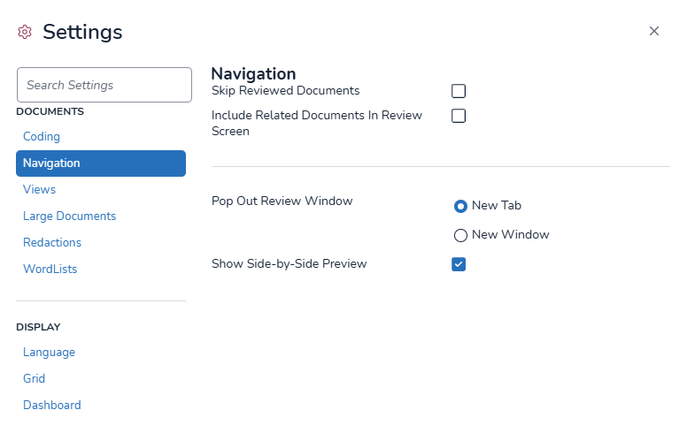
Skip Reviewed Documents improves efficiency of first-level review: Where, for example, a document and several family members have been coded together, this setting will skip ahead to the next parent in the assignment folder. This feature is turned Off by default, in part because on a coding verification sampling review navigation will not occur since all documents in the set have already been reviewed for that Tag Profile.
Include Related Documents in Review Screen adds a Related Documents pane in the Document Review screen where a custom relationship field is present in the current Field Profile and populated with the same value as other documents.
Pop Out Review Window is a control added in Reveal 11.5 providing the choice to open the Document Viewer in a new browser tab or to open a new window, which is useful in multi-display setups.
Show Side-by-Side Preview is an Early Access feature added to Reveal 2024.7 that changes the action of the Grid documents’ View button to open a split screen document viewer that interacts with the Grid.
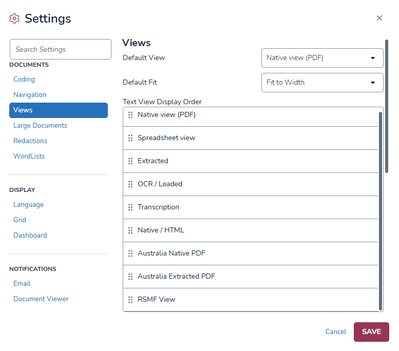
Views - Sets default text set to be displayed in the Document Review screen viewer, the default Image Set to display where more than one Image Set is present, and as of Reveal 2024.7, the order in which Image views are to be presented. The Default view is set to Native view (PDF), and the default for Text Set is Native View. Additional settings are available as you scroll down below to further specify the display of the text set selected.
Large Documents - Sets the size threshold and action to be taken in handing a large document during review.
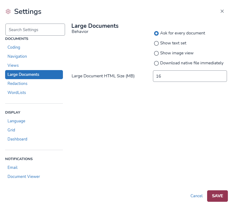
Behavior - Select one of four options for Reveal's handling of a large document in the Document Review screen:
Ask for every document (default)
Show text set
Show image view
Download native file immediately
Large Document HTML Size (MB) sets a threshold for applying the Behavior rules; the default value is 25MB.
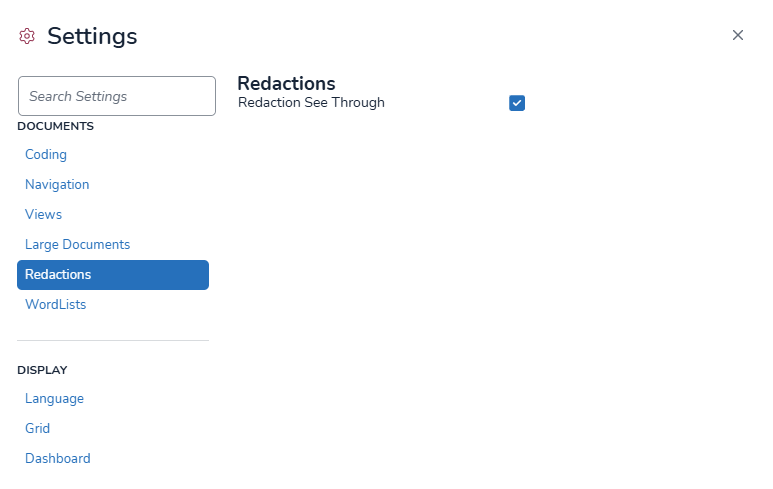
Redactions - A single choice, Redactions See Through, affords the reviewer the ability to see the content being redacted during review. Redactions are rendered opaque and underlying text is removed upon production. Default: On.
Wordlists - Settings regarding defined Wordlist highlighting and navigation in the Document Review screen.
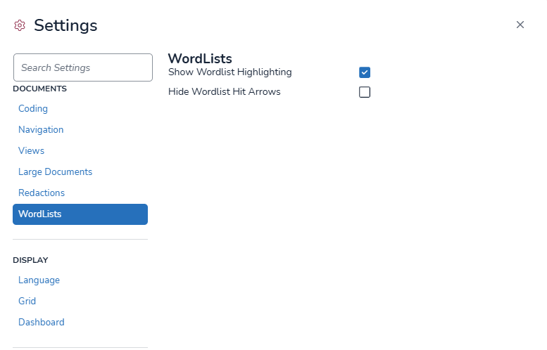
Show Wordlist Highlighting elects the display of Wordlist entries in the Text view. The reviewer may elect which of the assigned Wordlists to turn on or off in the Document Review toolbar. Default: On.
Hide Wordlist Hit Arrows turns off the display of forward and backward hit navigation arrows to declutter what may be a busy highlighting display. Default: Off (arrows will be displayed).
Security - This setting toggles whether document level security is applied to an admin-level user. It allows an admin to toggle between a secured/not secured view when testing if document level security is working as expected.
Note
This does not affect the security of documents, it only changes what documents the administrator can view.

Note
This setting only appears when document level security is enabled for the project in Review Manager.
Display
Language
Language - for the Reveal application interface may be set for any of several world languages. Additional languages are being added, with Arabic, Korean, Portuguese and Russian to appear in an upcoming release.
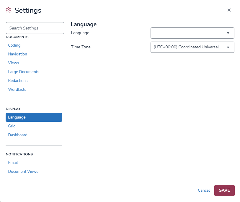
Application display languages include:
Arabic
Chinese (Simplified)
Chinese (Traditional)
English (United Kingdom)
English (US)
French
German
Italian
Japanese
Korean
Nederlands (Dutch)
Portuguese
Russian
Spanish
Time Zone - Users can now customize how time is displayed across the application by selecting their preferred time zone to provide a more localized experience. To learn more about this feature go to Time Zone Changes.
Grid offers options to enhance the readability of the table and related views:
Alternating Row Colors (default: Off).
Vertical Grid Lines (default: Off).
Show Thumbnail Viewer (default: On) displays a panel of page images to the left of the Image Viewer window to help in previewing rough content and navigating to a page. Turned On by default, this may be turned off to provide more Image Viewer space for a page, or to speed up display of larger document images.
Row Number On provides optional further reference for examining the contents of the Grid by displaying a number next to each row. Default: Off.
Grid Row Spacing allows customization of the density of a user’s Grid view:
Compact packs the most data into the table.
Cozy is the default.
Roomy spreads material for easier viewing.
Empty Grid Cell Display offers the option of displaying a document field having no value with a Dash or Blank.
Dashboard allows the user to customize the display and order of all graphical widgets on the dashboard. For any of the following items (or any that may be added to the Dashboard), check or uncheck Widget On/Off for the item to control its display, and either drag the handle at the left or enter its numerical Display Order at the right:
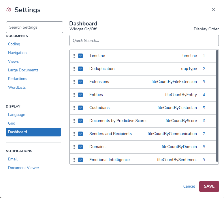
Timeline
Deduplication (Candy Bar)
Extensions
Entities
Custodians
Documents by Predictive Scores
Senders and Recipients
Domains
Emotional Intelligence
Notifications
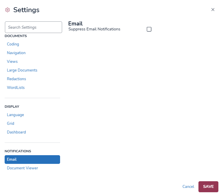
Email offers a single option, to Suppress Email Notifications, allowing the user to elect not to receive emails reporting the status of any of a number of Jobs that may have been submitted by the user. Many such notifications may be generated in the course of normal review.
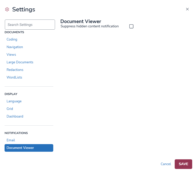
Document Viewer contains one control, Suppress hidden content notification. This turns off hidden content advisories in Document Viewer that may not be warranted at a certain phase of review. The Hidden Content icon will still show that there is hidden content viewable at the user’s option.
Time Zone Changes
The time zone setting changes the time zone selected for your project to another time zone of your choice. This will update some - but not all - times displayed in Reveal to match your chosen time zone. See Times that Update and Times that Do Not Update for a list of which time zones change with the setting.
Times that Update
The following areas update to match the time zone you selected in settings:
Dates and times visible in standardizes tables, seen mostly in displaying information related to jobs or actions performed in Reveal (e.g., for Archives, shown below).

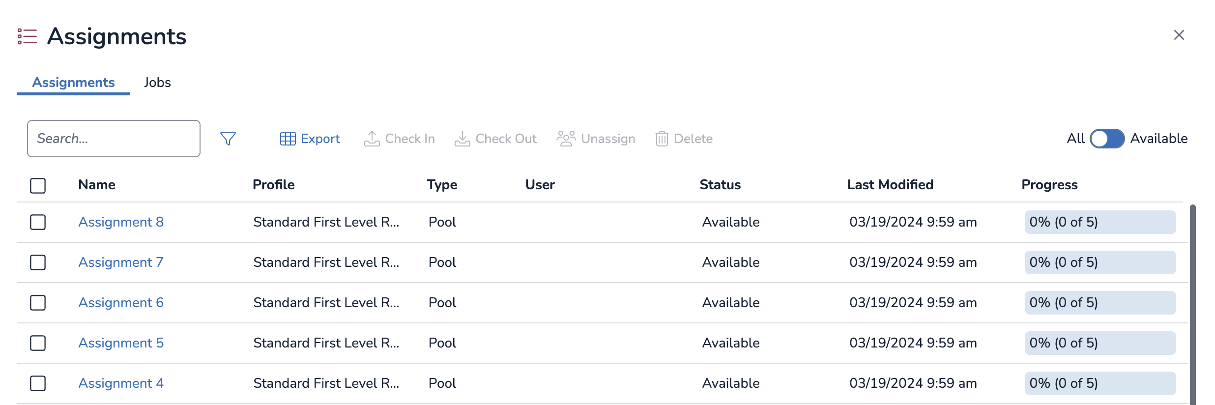
Dates and times in the Assignments table (shown below).
Dates and times in the Uploads table.

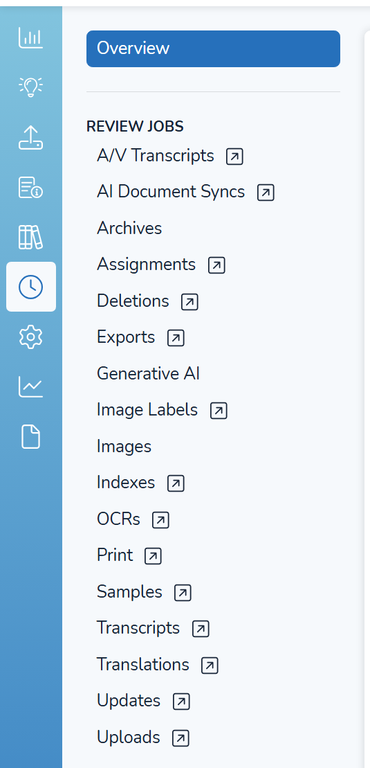
Dates and times in the Jobs screen (shown below). ASPX pages (identifiable by a
 boxed arrow icon) will display a message saying that time shown have been adjusted to selected your time zone setting at the top of each table.RENT-2064520645
Dates and times in the Project Admin screen, specifically in the Hit Reports page, in the Wordlists tab (shown below).

Dates and times in the Production tab, in all four pages shown below.

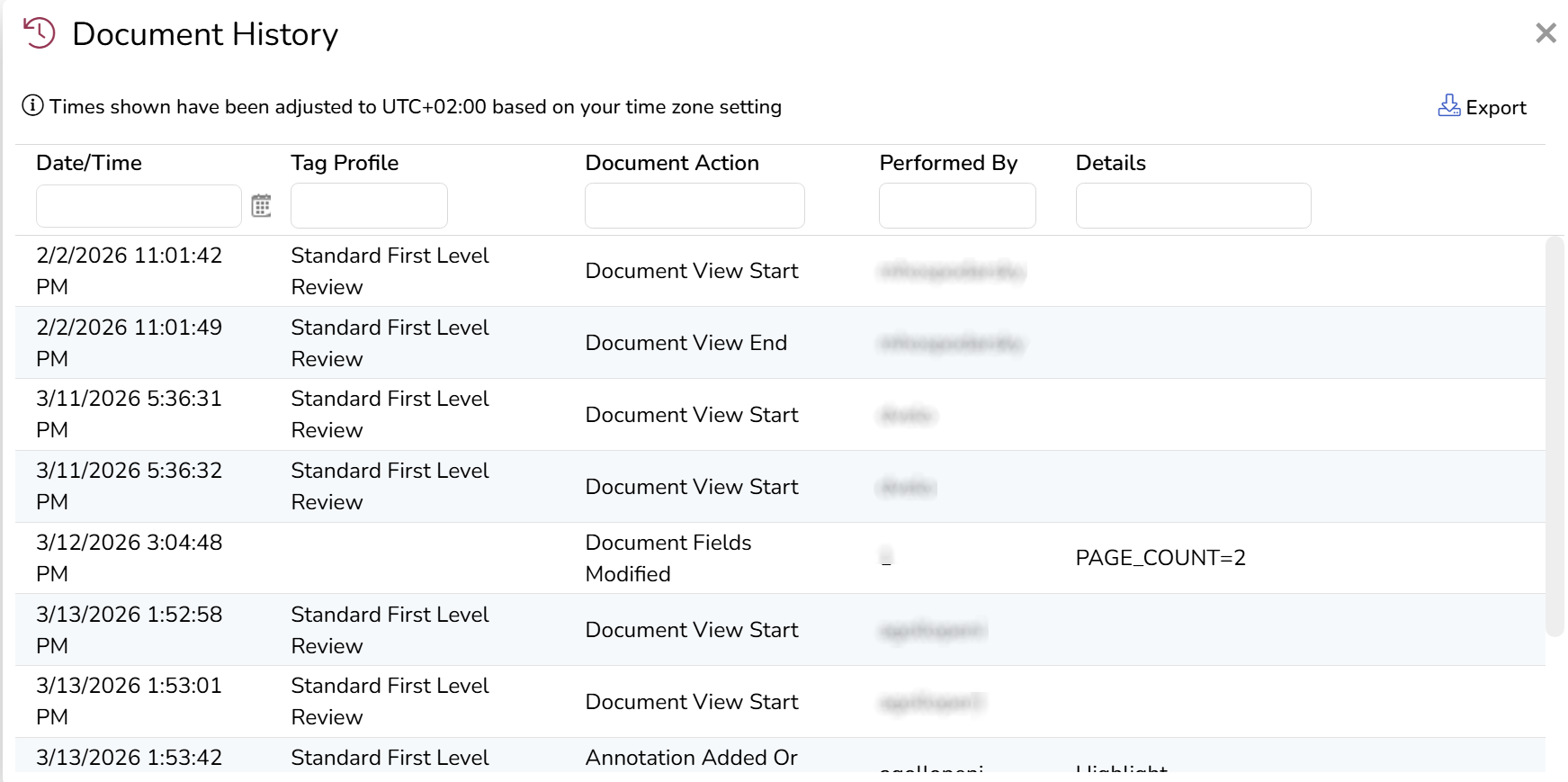
Dates and times in the Document History modal, in the Document Viewer.
Times that Do Not Update
The following area do not Update, and will show the same time regardless of time zone you select in settings:
Date/time metadata attached to the data you upload or process into Reveal.
Date/time metadata displayed in the Review Grid, ECA Grid, and Processing Grid.
Dates and times associated with performing a search on metadata.
This includes the date/time you enter in the search field, as well as the date/time results of your search.
Dates/times in the Search History log and Saved Searches.
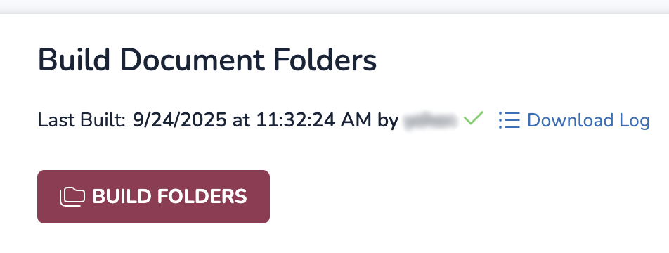
The date and time displayed in the “Last Built” value for Build Document Folders (shown below) and Rebuild Document Data.
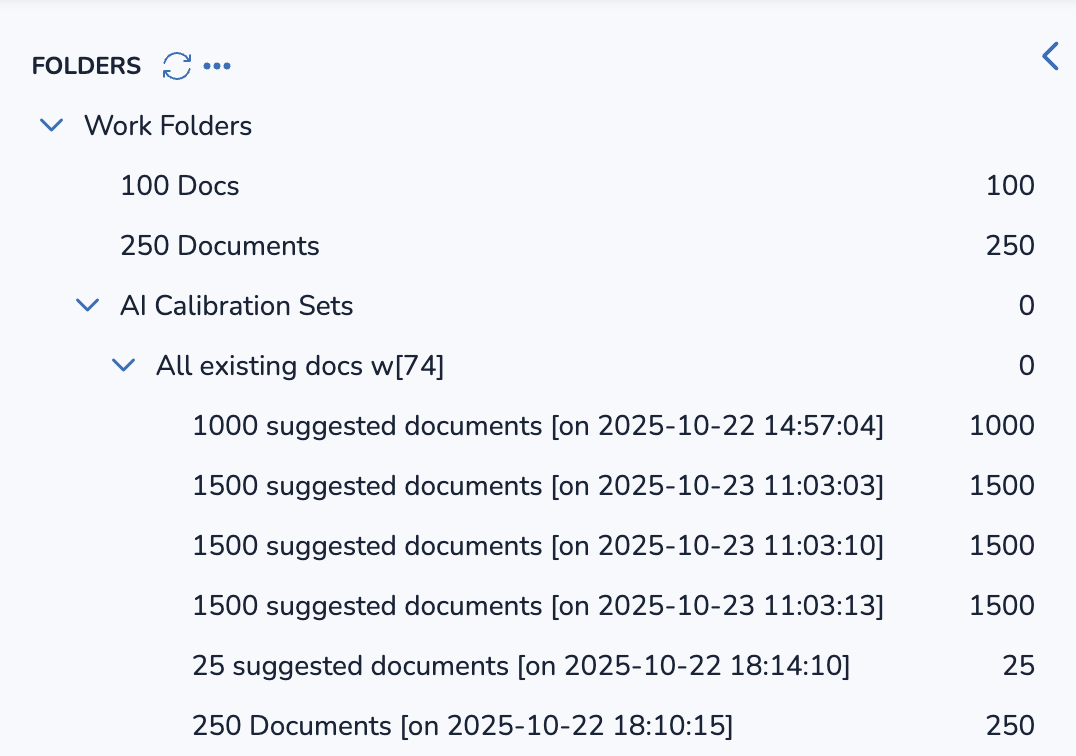
Date/times attached to Work Folders, like AI Calibration Sets (shown below).
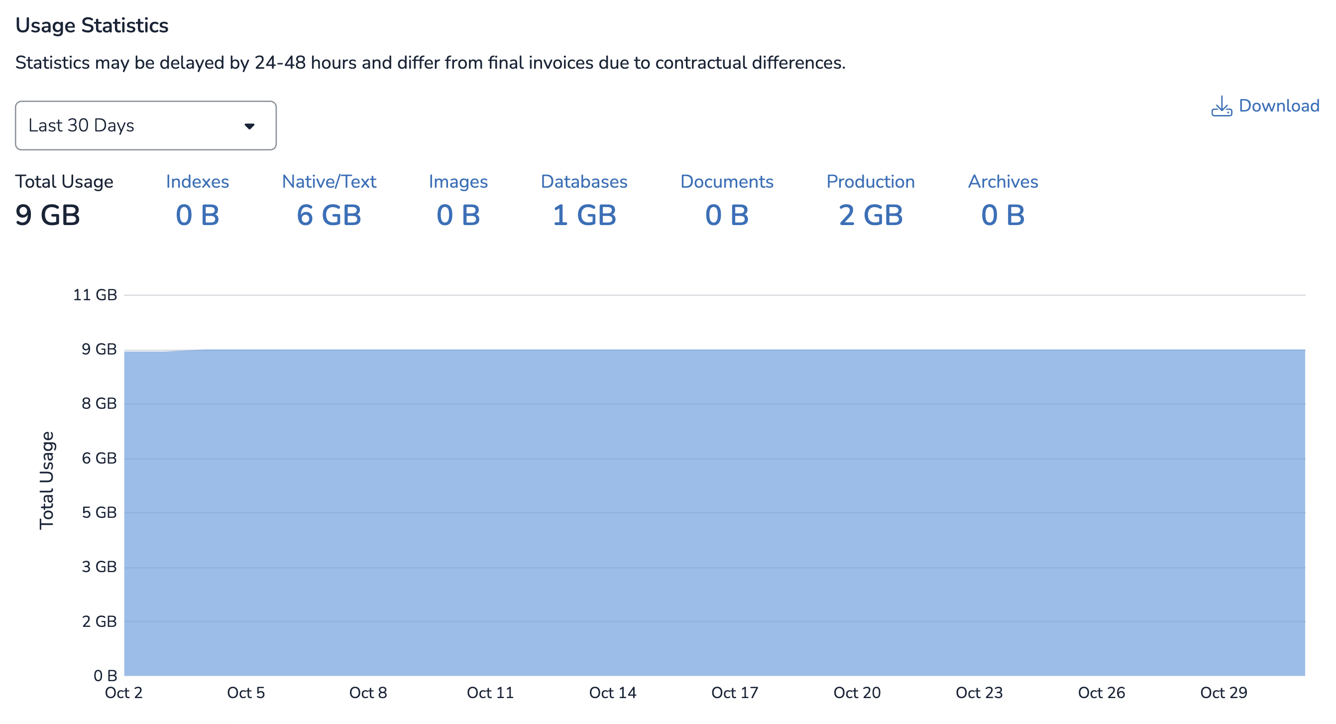
Usage statistics graphs (shown below).
Other dates and times displayed in Reveal that are not explicitly mentioned in the Times that Update section.